Redesigning Skrill's onboarding journey
⏱ 4 minute read
Overview
At Skrill, our registration and onboarding process was sub-optimal. We identified this by looking at conversion rate numbers and performing a series of user interviews.
Our goal was to decrease the drop-off rate in our onboarding process.
My role
I was the lead product designer on this project – which meant I had to collaborate with a multitude of different teams and get involved in various activities:
- Work with user researchers to 🔬 gather insights for areas people were struggling with.
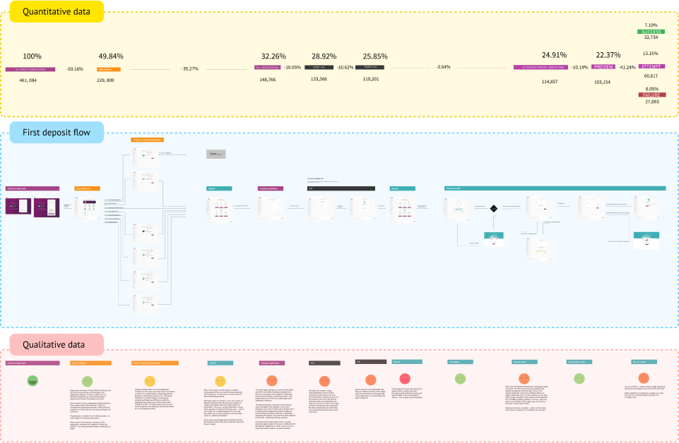
- Work with data analysts to 📊 review quantitative metrics in key points in the user's journey.
- Review data and ✨ create a hypothesis for improvement
- 🎤 Present findings and ideas to stakeholders
- Leverage our design system to 🖌️ create a usable UI
- Hand-off to developers and ⛑️ aid implementation
- Work with product managers to 📝 plan, roll out and oversee testing
Problem discovery
Our onboarding experience was burdened by technical and UX debt. We knew it could be improved and were further convinced by looking at the data – there was a significant drop-off at a point in the journey where we asked people to provide additional details and complete their accounts.
To get a better understanding of what was going on, we conducted 15 user interviews with clients from multiple countries. We asked them to go through the sign-up flow, get verified, make a deposit and start using Skrill – what people told us matched the funnel data, providing more detail and nuance to the problem.
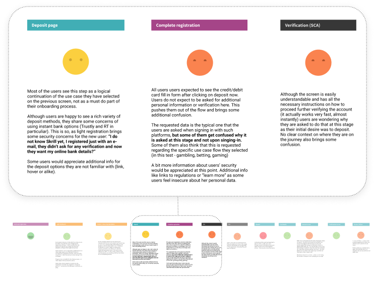
After gathering all the data, we mapped out the first-deposit user flow and connected quantitative and qualitative information for each checkpoint, creating a more detailed user journey.
We discovered that the user journey was fragmented and did not follow a predictable set of actions – we made promises in our value props we did not keep – this frustrated users, causing them not to complete their sign-up and leave Skrill.
Problem definition
To narrow in the problem space, I broke the problem down into two main issues:
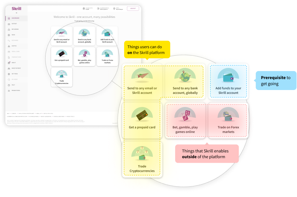
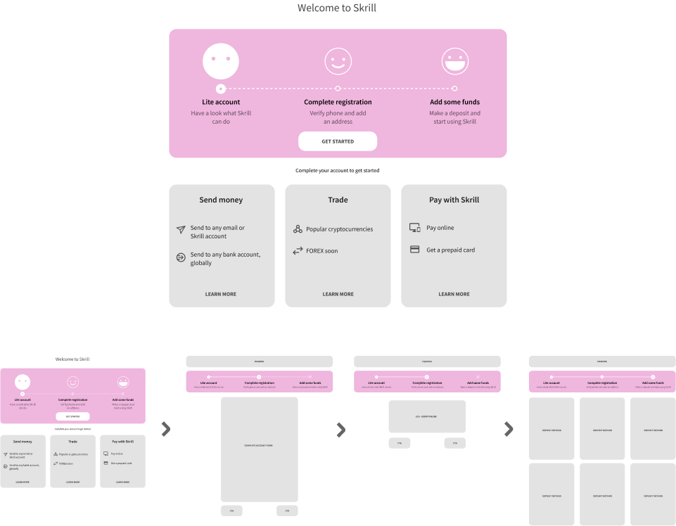
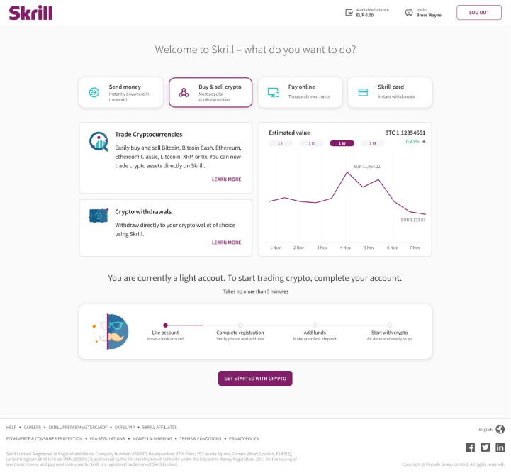
Issue 1: We did not do a great job of building a mental model for our users – after creating a Light Account, our Light Dashboard gave users the impression that they could do many things, while in reality, arguably the only valuable thing they could do is make a Full Account by doing a first-deposit.
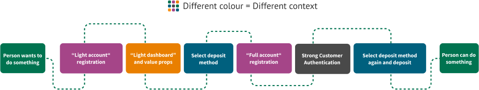
Issue 2: Unexpected context switching and deviations from their task confused users. People started one action but were constantly interrupted by the system asking them to perform other actions.
Opting for 80/20
Our digital wallet provided many value props – each with its little stack of prerequisites and user flows, so instead of doing a complete overhaul of the entire journey, we decided to go for the least amount of changes that could generate the most improvement and could be tested and observed right away.
Solution hypothesis
The main improvement idea was to reduce the switching of context – tweak the perception that every step, as well as the first deposit, is part of one single "account setup" phase.
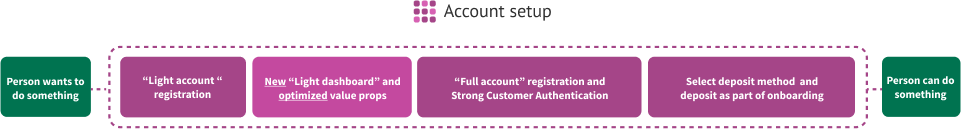
Users could technically do some things in Skrill with a Light Account, but we needed to signal that this is a limited experience and entice people to complete their accounts to get going with our product.
To achieve this, we had to set expectations at the beginning – what is possible and what is necessary to do the thing users are here to do and make our system provide feedback at each step of the journey - where the user is and what is next.
Beyond these enhancements, the idea evolved into capturing user intent at the beginning, providing relevant information and guiding people beyond their account setup to achieve their goal.
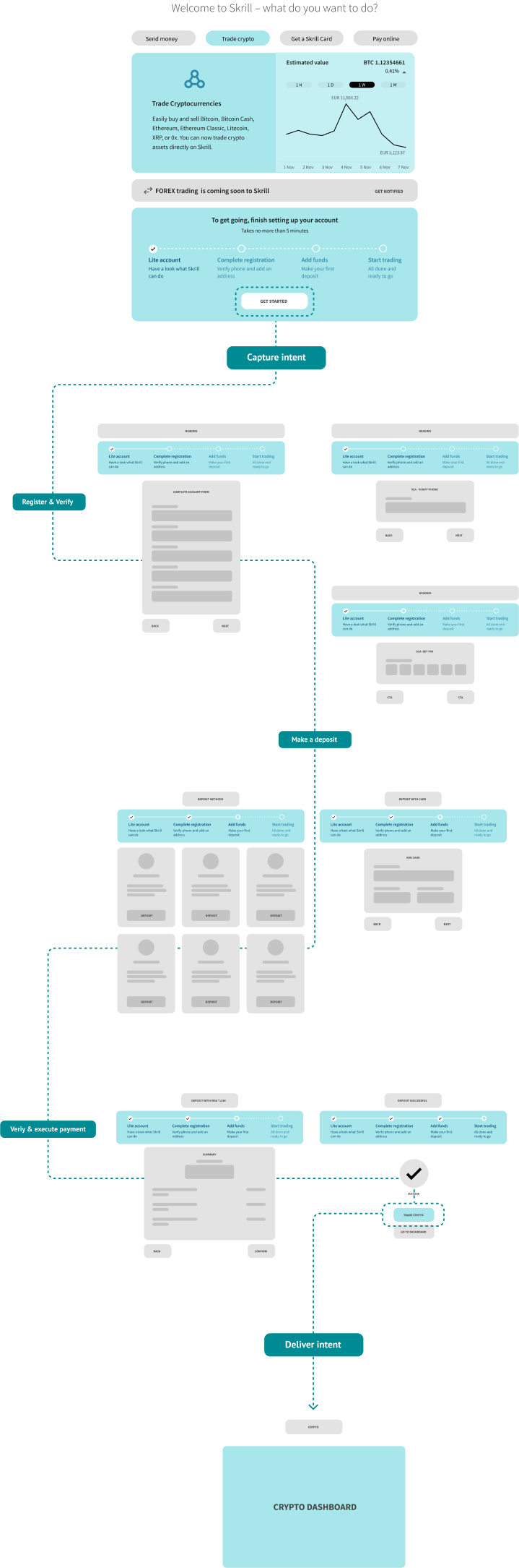
Capturing intent at the beginning enabled us to point the user to their desired path at the end of the onboarding journey.
User testing
Before starting development, we did a few moderated user tests on usertesting.com – the goal was to gather perceptions and validate there were no major gaps in our concept.
Due to the fiscal nature of our product, we wanted to perform live tests with our customers at scale before we do a major rollout.
We did this using Adobe Target in a few key regions – approximately half of the users visiting our platform were shown the new version of the onboarding and the other half the old implementation.
Visual design & implementation
In the spirit of fast and lean iteration, I leveraged our existing design systems and UI patterns to minimize development time and try to validate the key concepts faster, opting to enhance our visuals further should our solution work well.
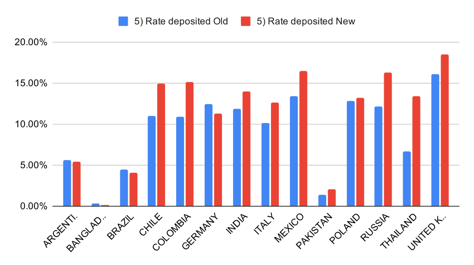
Outcomes
We saw an improvement across all areas and regions that we tested.In some parts of the funnel, the drop-off rate decreased by close to 30%. People were completing their account registrations more often.
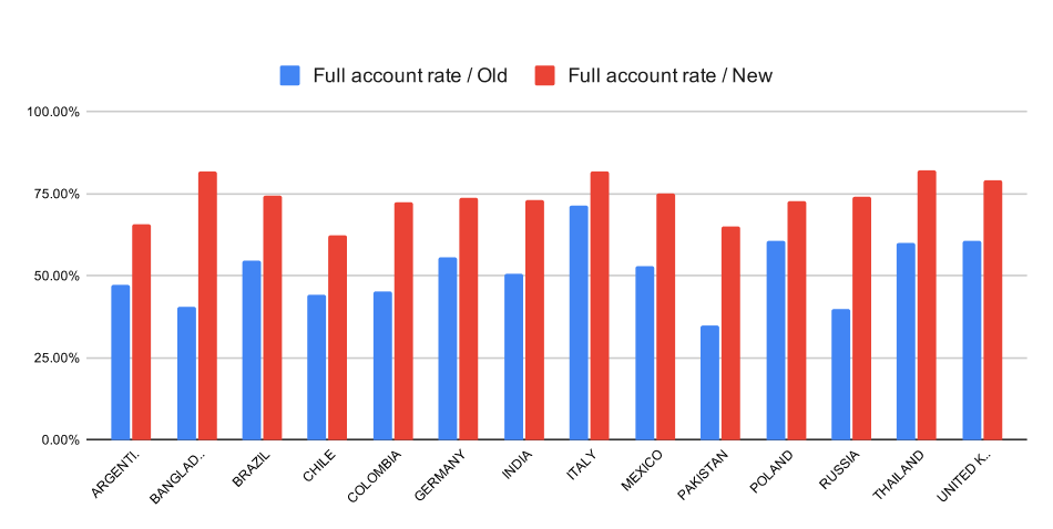
In others areas the change was not that big – deposits in the UK, for example, saw only a 2% improvement.
Lessons learned
This experience forced us to look outside of silos and consider user flows more holistically – people do not want to set up an account and deposit money for the sake of it – they want to do something else outside of our product, and our features are just a means to an end.
This project inspired us to do diary studies with users and better understand their overall needs for using the Skrill platform.
Thank you for reading!